Interactive license chooser
Contents
Proposed Interactive License Chooser
Proposal
The chooser right now is functional as a tool for the selection of licenses and generating the appropriate metadata, but does so with ui conventions that contradict its actual purpose. The first problem is that the user fills out a form, presses a button, and receives a license and metadata; this suggests that it is a registry or license generator of some kind - of which it is neither. The second problem is that while the deeds convey information about if a license is free culture approved or not; the user does not know to look for this information. The chooser can easily unintrusively provide this same information, enabling the user to make a more informed decision about their license choice. In the interest of objectivity, the UI changes should be informative and not "make NC scary".
It also may be useful to include some means of making CC0 accessible to individuals who would prefer that sort of thing. (I personally like a "don't care" option that ends up with CC0 instead of a license, but that would be the wrong way to go about it).
Visual Implementation
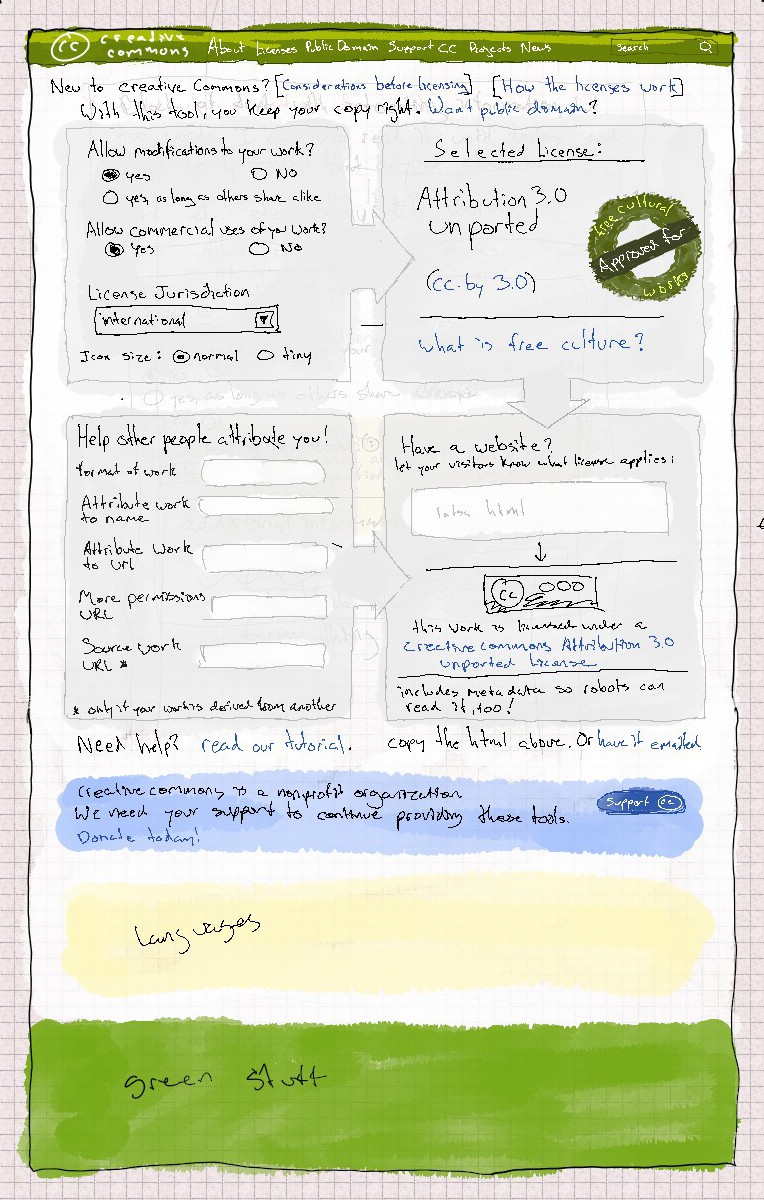
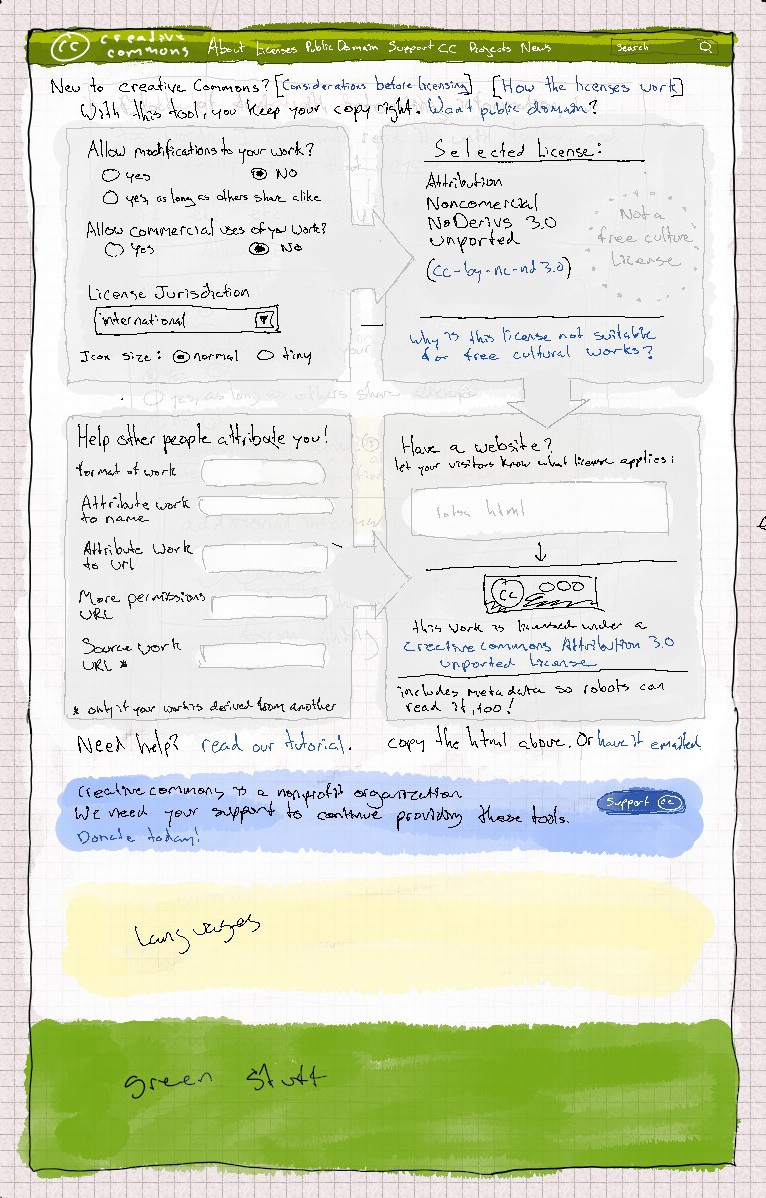
The "registry / generator" problem can be solved by having the chooser page also be the results page. If javascript is enabled, when the user makes a selection of some kind or changes something in a field, the chooser updates the metadata on the page as well as something like "based on the current selection, you get the CC-BY-SA, here is the metadata & badge to copy into your page" or something to that effect. Depending on the license, the "free culture approved" logo should appear or fade into a dotted outline. Accompanying text will say something like "CC-BY is a free culture approved license. Click here to find out why." Or "CC-BY-NC-ND" is not a free culture approved license. Click here to find out why."
If javascript is enabled, there is no need for some kind of form submit button, since the effect is accomplished transparently by javascript. If javascript is not enabled, then a button labeled something to the effect of "update page" will be visible; pushing the button will be similar to how the chooser currently works, except that the page the user is directed to next is the same url + cgi inputs.
In execution, this should be a process that should allow the user to refine their input easily without backtracking. The current manifestation of the chooser uses a design that suggests that the user has to get it right on the first try.
The current results page isn't well organized. There is a lot of information that most users will ignore, such as the entire contents of the sidebar on the right. Everything does not need to be presented at once; the box containing the html fragment could also have tabs above it so the user may select which format they want (such as XMP). Visual elements on the current page could be easily consolidated without making the tool seem cluttered.
Technical Implementation
Currently, one goes to http://creativecommons.org/choose/ to open the chooser, and then hits "select a license" to be directed to http://creativecommons.org/choose/results-one to view the result. This second url will be kept as it is now, as people will some times link to that instead of the deed. The "select a license" equivalent in the new version will direct back to http://creativecommons.org/choose/ + the cgi string to produce the new results.
When javascript is available; when the user changes a radio button or when a text field has been sufficiently altered; the chooser will use XHR to poll the server for page updates. As to not make overly redundant requests, "sufficiently altered" means either when the field no longer has input focus (and contains a new value than before), or a small delay after a key press. The keyup event will start a timeout, the keydown event will clear that timeout; so if the timeout is uninterrupted, then the request will be sent out. It could also be that we implement this so that the client receives a metadata template based on the fields that actually have content, and that the page script itself fills in the blanks. This would greatly reduce the possible server responses, and therefor let them all be cached.
In both cases, CSS transitions may be used to fluidly change elements on the page and to make the new workflow very intuitive.
UI Draft Images
The above describes a different design philosophy, in which the chooser behaves more like an application which the user uses to explore the license options, than something bearing a confusing resemblance to a registration tool.
As with the "4.0" errata tool, fancy diagrams will appear below soon to give you a better idea of what we're after with this. Note, I forgot a few things in the pictures below, namely incorporating "the color of freedom" thing into the chooser (green / yellow depending on license). I also forgot to add a radio button for offline works, which changes the content of the bottom right quadrant of the ui, and what it would look like with javascript disabled. I make another draft that addresses these scenarios tomorrow.

